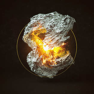
Abstract #3
Nonrepresentational
Cinema 4D Render
50.8 cm x 19.1 cm
October 2018
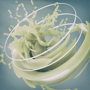
Cinema 4D Render
50.8 cm x 19.1 cm
October 2018
Exhibition Text
Nonrepresentational is a piece I created while reflecting on what I look for in my own art. When I started this piece I wasn't looking for anything, I knew I was inspired but I didn't know what I wanted to create. I was inspired by the abstract renders of Filip Hodas, I wanted to create something that explored my passion but wouldn't put boundaries on my process and final product.
Nonrepresentational is a piece I created while reflecting on what I look for in my own art. When I started this piece I wasn't looking for anything, I knew I was inspired but I didn't know what I wanted to create. I was inspired by the abstract renders of Filip Hodas, I wanted to create something that explored my passion but wouldn't put boundaries on my process and final product.
(Click To Zoom)
Planning
|
Inspiration
Filip Hodas is modern surrealist using C4D as his primary medium. In 2015 he began creating daily renders as to improve his skill and technique. After browsing his portfolio and various others I decided to open my software and just let it take me wherever it wanted to. I knew to some extent that I wanted to incorporate some of Filip's elements, one of the more challenging elements I noticed in a few of his pieces was a clear/liquid material that had plenty of internal light refractions. Another element found in quite a few of his pieces were these subtle light rings that add some form of framing to the composition. One of the things that my inspiration prompted me to do was change my image resolution. Filip sticks to a pretty safe and standard resolution of 1200 px by 1200 px, I wanted to do something a bit more unique. I eventually decided that a banner style resolution would be appropriate for my work. Going into this project I knew that I had a few technical setbacks that Filip doesn't have, I do not own the Octane Renderer or the X-Particles plugin. Both of those tools are vital to creating smooth and detailed particle based renders. So to combat this I decided to focus on creating a complex material and still include other general aspects found in his portfolio. This kind of bizarre style of inspiration eliminated the need for going to my sketchbook immediately, instead I decided to just start demoing what I thought might be a good start to a project. I figured I would start purely in gray scale, and using only rigid bodies to do any planning composition. |
"Daily Renders #02", 2015, Filip Hodas
"Daily Renders #02", 2015, Filip Hodas
|
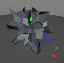
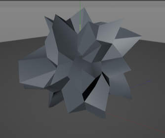
Planning Sketches

|
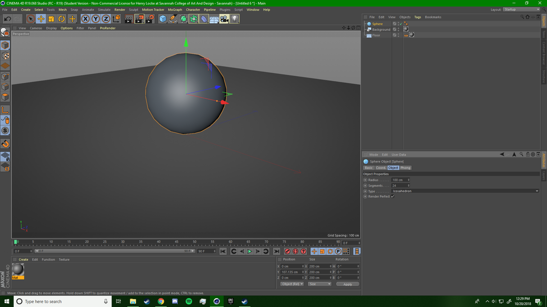
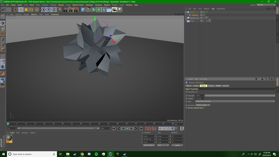
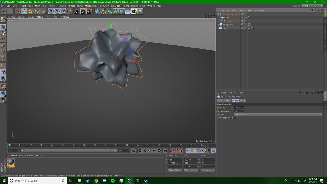
Sketch #1 This first mock up was simply a sphere with a basic displacement deformer applied to it. When I first started drafting I thought that I might just have a single object in frame. This first sketch also has far more segments and faces than I ended up needing and wanting to be in my final product. It was messy, and not thoughtfully designed, however it gave me a clearer ambition for my next sketch. Sketch #2 My second planning guide was far simpler in terms of geometry. I lowered my segment by about 30% and shortened the height radius for the displacement of the peak vertices. This did create some awkward geometry that wouldn't smooth out properly but I wasn't terribly worried about that seeing as this was just a planning sketch. By lowering the vertices I knew that my object would create cleaner, and less noisy internal light refractions. I felt a lot better about this rigid body structure and decided to later work off of it for my final product. Sketch #3 This final sketch was after about 15 minutes of tweaking the previous sketch's geometry and adding a subdivision surface. I also added a ring to the work because I wanted to incorporate some of Filip's techniques. Once the geometry was smoothed out I began rotating on all of it's axis's to find an interesting and clean section that I could use in the final image. This sketch ended being what I used to start modelling the project. |
Process
Modelling:
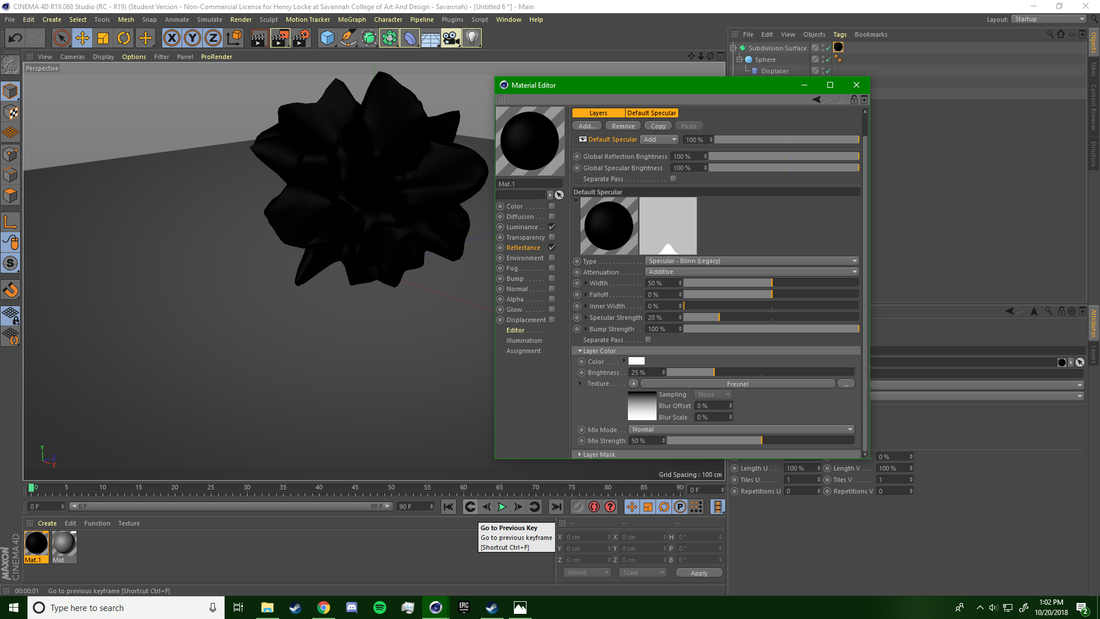
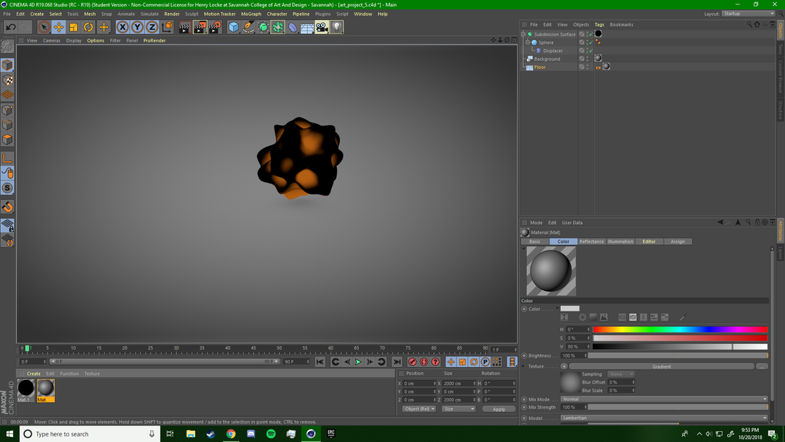
This project has a somewhat similar style of modelling as compared to my first abstract piece "Caged Development". To begin I added a sphere to the shot and then attached a displacement modifier as a child tag to the sphere. Many 3D artists including Filip Hodas use this modifier to get exaggerated points out of simple objects. Before adding the displacement modifier it is important to increase the quantity of your object's segments, this allows for easier smoothing and fewer sharp edges. To get the spiky ball effect with the displacer you have a high strength value (70% or greater) and you want the Intensity Type to be set to centered. The next step in the process was what made this modelling technique unique from my previous techniques. To make the orb form continually editable I added a subdivision surface as a parent tag to the sphere, this additionally smoothed the orb out and removed the edges. The final step in the modelling process was modelling the thin accent ring the Filip includes in many of his pieces. This was fairly simple, I added a torus, and bumped the segments way up so that it didn't have it's basic and chunky form.
This project has a somewhat similar style of modelling as compared to my first abstract piece "Caged Development". To begin I added a sphere to the shot and then attached a displacement modifier as a child tag to the sphere. Many 3D artists including Filip Hodas use this modifier to get exaggerated points out of simple objects. Before adding the displacement modifier it is important to increase the quantity of your object's segments, this allows for easier smoothing and fewer sharp edges. To get the spiky ball effect with the displacer you have a high strength value (70% or greater) and you want the Intensity Type to be set to centered. The next step in the process was what made this modelling technique unique from my previous techniques. To make the orb form continually editable I added a subdivision surface as a parent tag to the sphere, this additionally smoothed the orb out and removed the edges. The final step in the modelling process was modelling the thin accent ring the Filip includes in many of his pieces. This was fairly simple, I added a torus, and bumped the segments way up so that it didn't have it's basic and chunky form.
|
Lighting and Material Design:
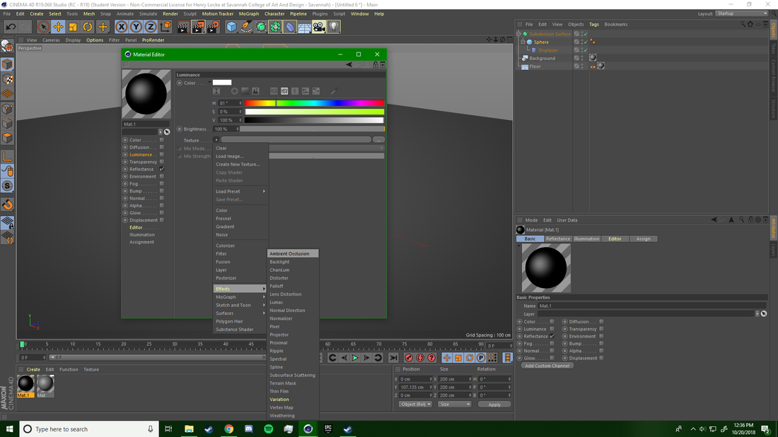
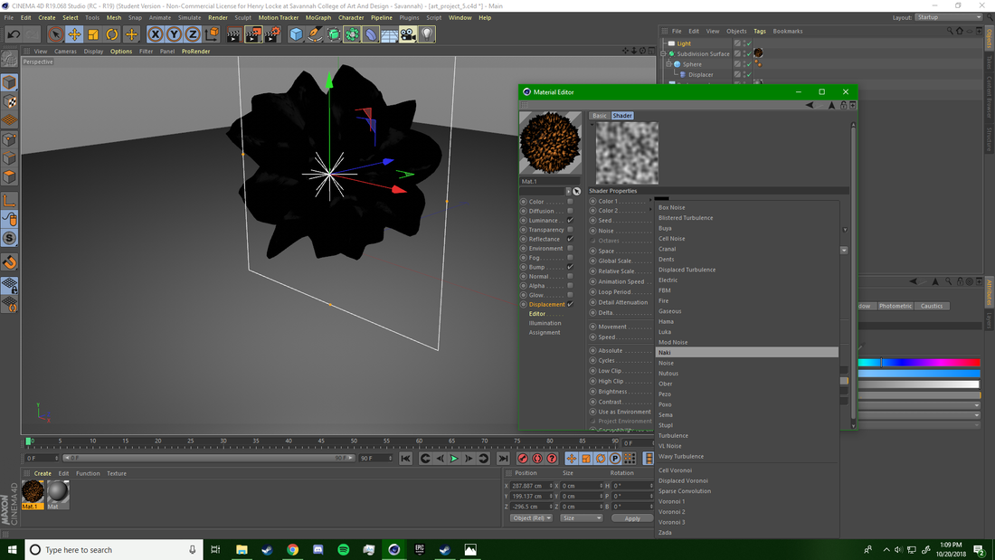
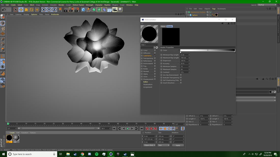
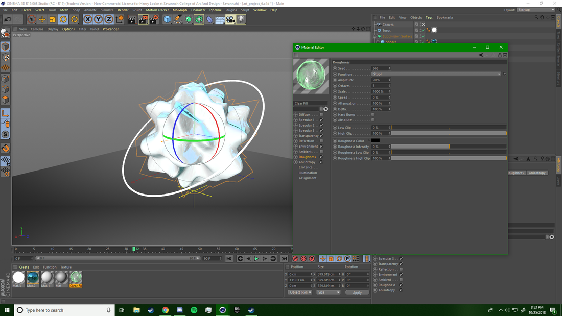
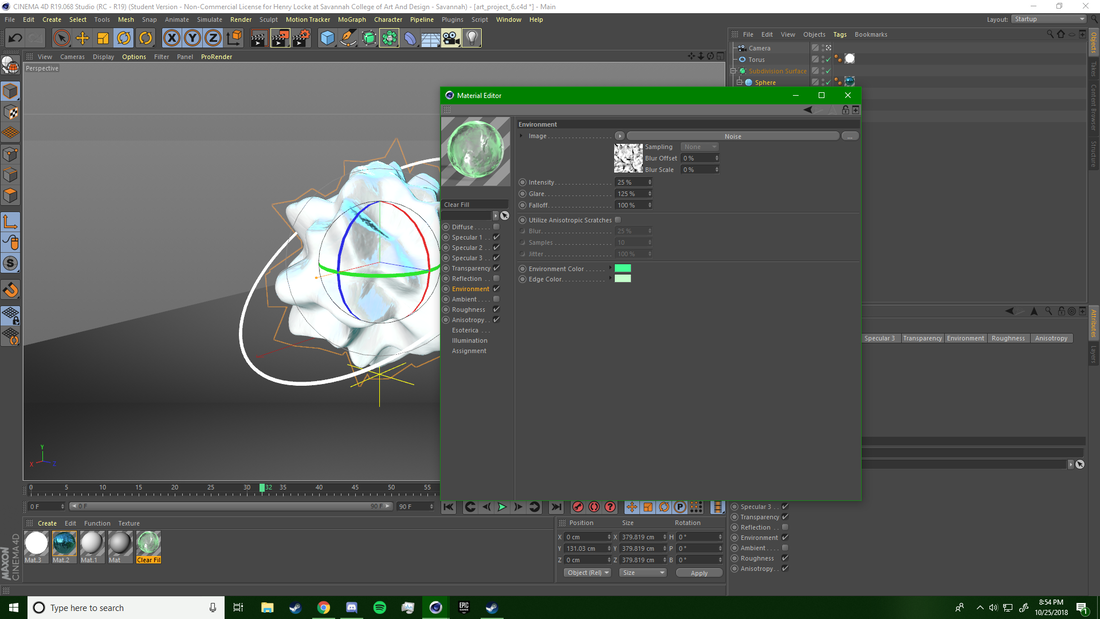
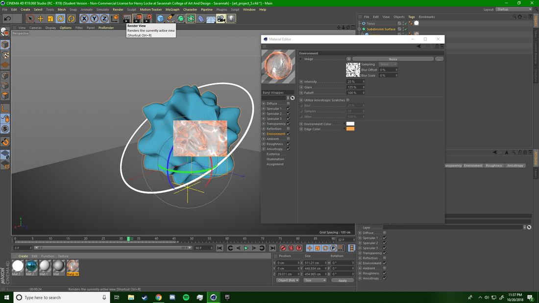
The primary material for this project was quite a tedious one to produce. In order to create the clear effect I needed to customize and design 4 material channels; specular, roughness, transparency, anisotropy, and environment. The specular channels were the most complex to edit by far, in order to get what appear to be internal reflections throughout the material I added 3 specular levels. The first level was a high intensity level (125%) followed by a large glare (200%), and 100% falloff, this would produce large glares on the surface of the material. The second specular level was toned down significantly to produce more subtle glares that would be created within the object by turning the falloff percentage to 50. The final specular level was used to create a thick under-layer that would refract light gently, its primary purpose was to absorb the color values passed on from light rays and reflect them. The next channel I worked on was the transparency channel, I knew I wanted a thick but still clear fluid look. To achieve this look I kept the front and back opacity low and set it to 5%, however to still ensure a fair amount of transparency I turned the edge opacity to 45%. Now as I previously stated I wanted the glowing ring (that I would be texturing later) to have a fair amount of it's light refracting on the inside of the orb. To get this effect I played around with the refraction index until I landed at 1.1. The final edit I needed to make in this channel was simply flipping on the internal reflections setting. The next channel I didn't quite understand what I was doing with, so I essentially messed around with the settings until I got an effect that made the render result in reflections that had double normals in them as opposed to a single render or isotropic. In order to get a more realistic material you need to add some roughness to nearly every material you ever make- even fluids. I only added a very small amount of roughness to the material and it helped quite a bit to remove the computer-generated-gloss-look. Finally I edited the environment channel, this channel helps to control the way exterior lights will effect the material. This is also the channel I used to add the green highlights and edges to the piece. Creating the rings material was super simple and legitimately only required one step: increasing the luminance channel to max brightness. |
|
Rendering and Organization:
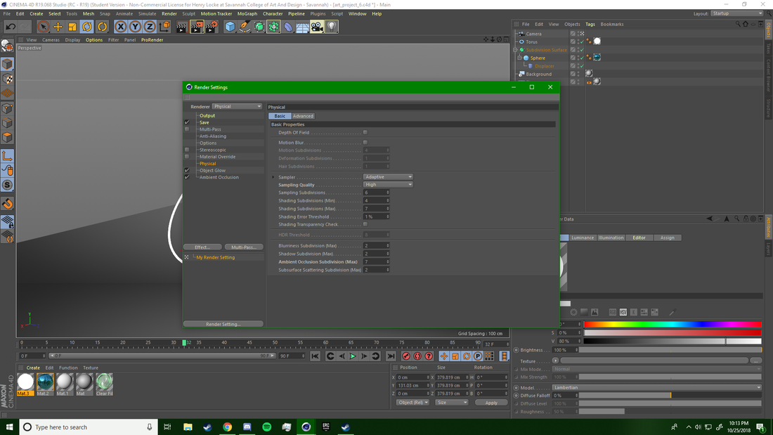
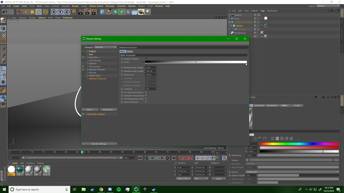
The rendering process truly makes or breaks a piece, the wrong settings can result in: a computer crash, lots of noise (white dots caused by too few samples being taken for each pixel), poor colors, unfocused objects, missing objects, poor framing, etc. Thankfully this is my third project in the medium and I already had a fairly decent idea of what I wanted the final render to look like just by playing around with the camera settings. For this project I decided to use the physical rendering engine- it produces a slightly more realistic feel for lighting and material saturation. I set my image resolution to 1920 x 720 pixels as to create a banner style render. This resolution creates a short and narrow frame that perfectly fits the orb between its' borders. Additionally I added ambient occlusion to the shot to produce a stronger glow from the colors within the orb, and to darken the vignette created by the infinite background. One of the benefits to using the Physical render engine over the standard one is that you can edit the number of sampling subdivisions, I set this value to 6 which is a fairly high setting. The final step was setting the resolution, now since this piece has a bit of strange aspect ratio I assumed would be getting closer to the image to look at it more closely- so I set the resolution to 300 pixels per inch, this was there would be plenty of pixels to prevent visible lines. Bumping the resolution up also helped the anti-aliasing look smoother.
The rendering process truly makes or breaks a piece, the wrong settings can result in: a computer crash, lots of noise (white dots caused by too few samples being taken for each pixel), poor colors, unfocused objects, missing objects, poor framing, etc. Thankfully this is my third project in the medium and I already had a fairly decent idea of what I wanted the final render to look like just by playing around with the camera settings. For this project I decided to use the physical rendering engine- it produces a slightly more realistic feel for lighting and material saturation. I set my image resolution to 1920 x 720 pixels as to create a banner style render. This resolution creates a short and narrow frame that perfectly fits the orb between its' borders. Additionally I added ambient occlusion to the shot to produce a stronger glow from the colors within the orb, and to darken the vignette created by the infinite background. One of the benefits to using the Physical render engine over the standard one is that you can edit the number of sampling subdivisions, I set this value to 6 which is a fairly high setting. The final step was setting the resolution, now since this piece has a bit of strange aspect ratio I assumed would be getting closer to the image to look at it more closely- so I set the resolution to 300 pixels per inch, this was there would be plenty of pixels to prevent visible lines. Bumping the resolution up also helped the anti-aliasing look smoother.
Experimentation
I have experimented with this piece more than any other piece I have ever made. Every single setting at one point or another changed, initially I even started modelling with a square as opposed to a sphere. One of the first things I experimented with was the material design. Initially I tried quite hard to develop a volcanic rock look that had an warm and orange-y glow coming from the inside of the orb. After hours work I came to the realization that I wouldn't be able to achieve this effect at my current C4D skill level. The fourth photo in the slideshow below shows my attempts at creating this internal glow. Once I decided to move on from the previous material I tried designing a metallic material that would resemble melting metal. I thought I could create a bleak, and industrial feeling piece by using plenty of dark gradients and high grain levels on the camera. This idea didn't quite work either, so I decided to modify the vibe of the piece and go for a more object oriented approach and that's what led me to creating the infinite background. The infinite background approach was definitely the right one and I experimented with the color theory behind it to finally land on the grey gradient. The ease and lack of risk of experimentation in digital media types is amazing and truly inspired me to keep being creative.
Reflection
This project pushed creatively in a kind of unique way and I am fairly content with my final product. I am very satisfied with the technique I used to get to my final product, and the perseverance I had to create a complex image even though I kept hitting walls. One of the best components of the project is the material I created for the center object it includes 3 specular maps and a lot of translucency and reflection editing. I can now use and reuse this material in various other projects and I plan on doing as such. I have made quite a bit of improvements since my last piece and only plan on continuing to grow within the medium. Perhaps I will attempt a pop culture reference, just as Filip has with his work.

"Daily Renders #02", 2015, Filip Hodas
Differences:
|
Compare & Contrast:
Similarities:
|

"Caged Development", 2018, Henry Locke
Differences:
|
ACT Responses
Clearly explain how you are able to identify the cause effect relationship between your inspiration and its effect on your artwork.
Filip Hodas has been creating for several years, regardless if he has inspiration or not he still creates a render, every day. His dedication inspired me to adopt a similar workflow to Filip and begin creating without an end goal.
What is the overall approach the author has regarding the topic of your inspiration?
The authors that wrote about Filip all regard him as surreal pop culture artist. He has created various works that showcase famous brands, characters, and items. His abstract work is rarely mentioned or analyzed.
What kind of generalizations and conclusions have you discovered about people, ideas, culture, etc. while you researched your inspiration?
People are attracted to art that they immediately can identify with or recognize a common theme in. My inspirational artist creates nonrepresentational pieces daily however he is only praised for his pop culture artwork.
What is the central idea or theme around your inspirational research?
My central idea around this projects inspirational research was focused on discovering techniques applied by nonrepresentational abstract artists, and what the art community thinks about their work.
What kind of inferences did you make while reading your research?
I once again have underestimated the amount of time and effort that goes into an artwork that isn't even based heavily off of a reference photo or work.
Bibliography
- Gould-Bourn, James. “The Apocalypse Of Pop Culture By Filip Hodas (10 Pics).” Bored Panda, 2017, www.boredpanda.com/pop-culture-digital-art-filip-hodas/?utm_source=google&utm_medium=organic&utm_campaign=organic.
- “Who Is the 3D Rendering Artist? | EASY RENDER.” Influences of Technology on Architecture and Design | EASY RENDER, www.easyrender.com/3d-artist/who-is-the-3d-rendering-artist.
- Hodas, Filip. “Daily Renders #02.” Behance, 29 June 2015, www.behance.net/gallery/27528945/Daily-renders-02.
