Block Print
|
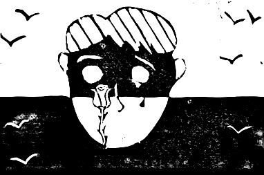
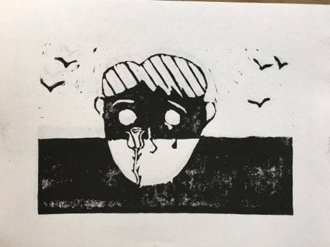
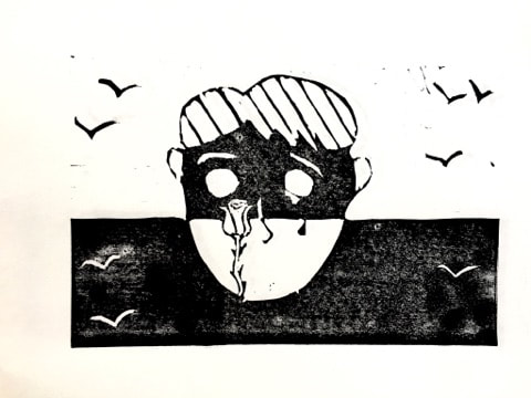
Fleeing Hope
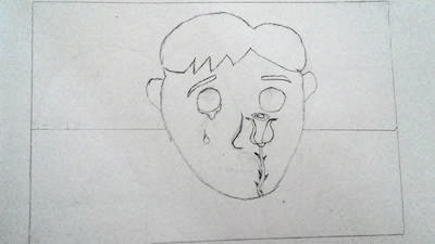
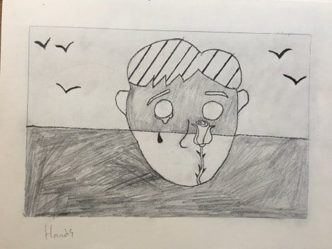
15 cm by 22.5 cm Block Print September 2017 Exhibition TextFleeing Hope is inspired by Pop-Artist Roy Lichtenstein's "Landscape", and the theme of hopelessness. The man portrayed is alone, looking at a rose he once viewed beautiful. My connection to theme is that all things become old, and most all things leave. I want the viewer to be contemplative of what they value, and what they have lost.
|
Planning
|
Inspiration
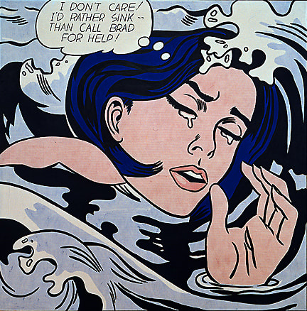
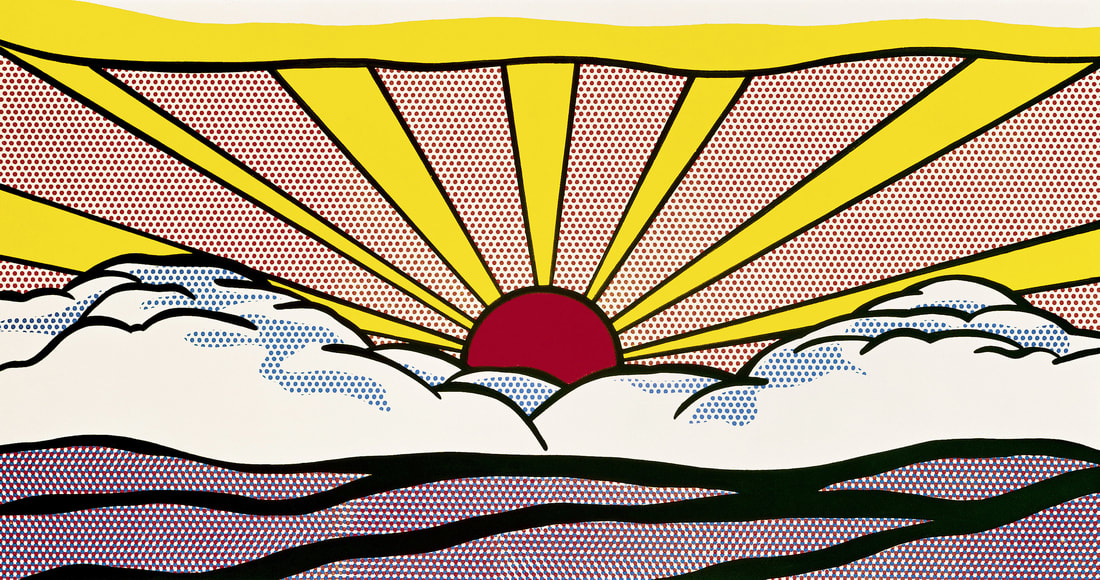
Immediately when presented with the Block Print assignment I knew I wanted to do a pop-art piece. To begin my research I looked for large pop-artists and came across Roy Lichtenstein. Roy Lichtenstein has many inspiring pieces and I found my idea for a theme when I came across "Drowning Girl". The way the water consumed her and she gave up, gave me the theme of hopelessness. However I wanted to a more simplistic design style and so I continued to look through his work. When I found "Landscape" I knew I found my style, it was simplistic enough to fit into a black and white block print but made complex by the use of line. He uses simple lines to communicate motion, mountains, and thoughts. I wanted my lines to have the same effect. The tears in "Drowning Girl" were also inspiring, she had given, expression is key and the way tears are puddled around her and not leaving seems to be symbolical of constant sadness. Next, I wanted a way to portray my inspiration, an event. Roy Lichtenstein's "Sunrise" set a horizon line that my piece could unfold on. I looked for a variety of ways to express contrast, and having a horizon line to split emotions was an inspiring method. Similarly to "Landscape" I wanted there to be reflection in my piece, as opposed to lines and shades across the face I replaced them with a rose. Something my character was gazing at. Roy Lichtenstein's interest in human expression truly brought on my theme, and gave me the idea of "Fleeing Hope". I did not want to show hope being consumed like "Drowning Girl" but rather it intentionally leaving the subject. Roy Lichtenstein inspired this fleeing sensation with his sun beams in "Sunrise" and the birds in "Landscape". |
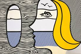
Roy Lichtenstein, "Landscape" (oil and Magna on canvas, 1977)
|
Planning Sketches
|
|
I initially created a mind map to summarize my theme, inspiration, techniques, and general planning. As you can see I drew a set of eyes similar to Roy Lichtenstein's "Girl with Hair Ribbon". I wanted to get experience with his style so I drew it multiple times. Additionally I analyzed many of his pieces to look for elements of design that I could incorporate into my own work. My first practice sketch was of a woman, the goal was create a simple cartoon human that was original but still incorporated elements used by Lichtenstein. At the top of the page you can see my connections to theme, art movements, artist, and inspiration artworks. In the middle of the page you can see my analysis of his elements, using abstract and simple versions of reality to communicate emotion. I noticed the pupils melted from the top of the eye like a tear drop. At the bottom of the page you can see where I got my inspiration for the birds and textured hair in my artwork.
My first planning sketch a rough tinkering with Lichtenstein's style. I did not incorporate my theme in this first planning sketch. The goal behind it was to use all of the principles of design. I incorporated line into the background, and used birds to hold his eyes. I used varying line thicknesses too to create contrast and definition. My second planning sketch is when I incorporated my theme into the piece as well. I used a horizon line to create contrast similar to "Sunrise", and I depicted birds flying away and line similar to "Landscape". The third planning sketch shown is most similar to my overall portfolio theme of Abstraction, it still incorporates all elements and principles of design that Roy Lichtenstein used but did not show enough contrast for my liking. The second sketch is most similar to a work by Lichtenstein and was my final sketch before I began printing. |
Process
Experimentation
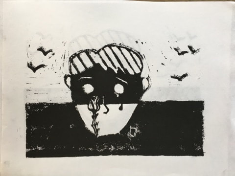
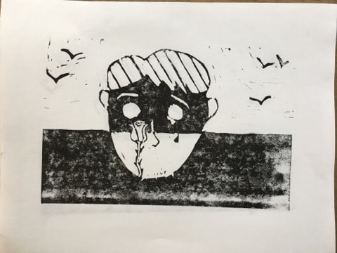
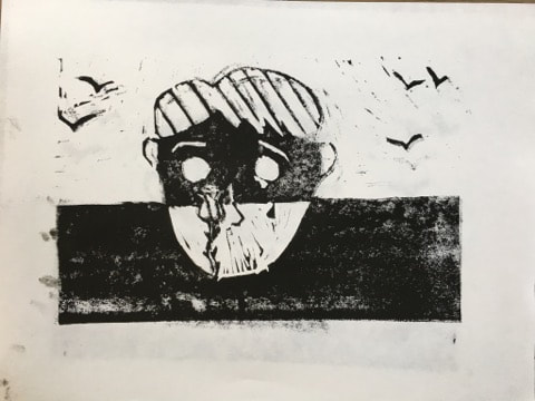
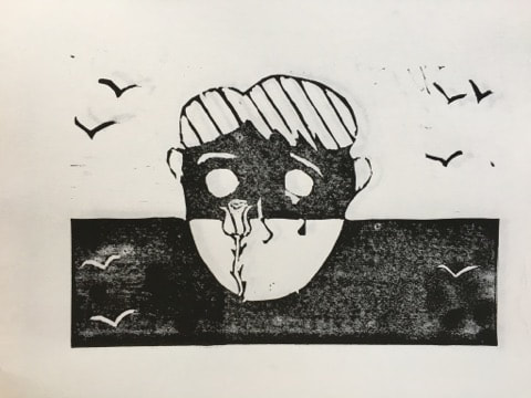
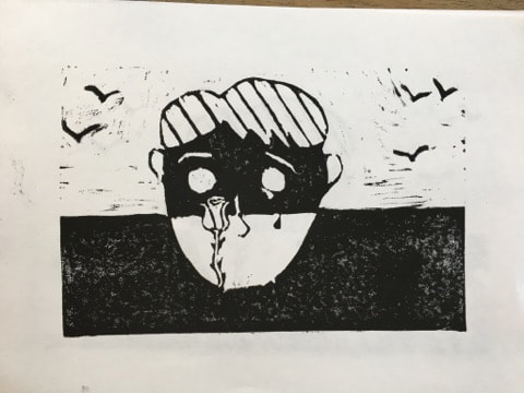
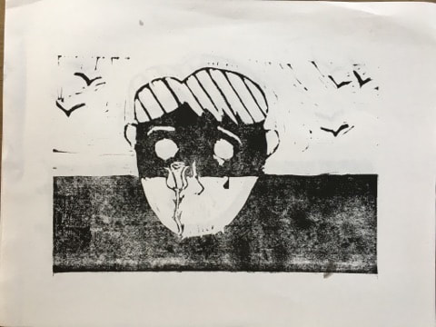
Above you can see 8 of my 11 block prints. There was quite a bit of change through out this process. I experimented with depth of my cuts into the linoleum block to see how the ink soaked in. With many of my experiments the cuts were not carved deep enough, so I went in and carved through it again. I quickly found out that the amount of ink I used also greatly affected the look of the piece. I tried using more ink but this only made splotches across the piece. I found that if I spread the ink out thoroughly with a brayer it became less splotchy and stuck to the paper easier. The use of the baren was also very important. The red plastic barens were ineffective when it came to smoothly pressing the paper, the older Japanese barens were far superior. I attempted pressing flat against the paper with the baren but I found it more effective to twist my wrist as I did this. I additionally experimented with different kinds of carving tools, The v-carving tool was useful for making deep for detailed cuts into the piece. I used this to make the white birds, eyebrows, nose, and the rose. Much of my experimentation was figuring out how to make the elements and principles of design elaborate upon my theme. This is where the dark contrasts, wispy line birds, and empty eyes came became more developed. After quite a bit of pressing and having failed to make dark prints, I added the birds as I said earlier but also left some lighter inking around them. This gave the piece quite a bit more gradient.
Above you can see 8 of my 11 block prints. There was quite a bit of change through out this process. I experimented with depth of my cuts into the linoleum block to see how the ink soaked in. With many of my experiments the cuts were not carved deep enough, so I went in and carved through it again. I quickly found out that the amount of ink I used also greatly affected the look of the piece. I tried using more ink but this only made splotches across the piece. I found that if I spread the ink out thoroughly with a brayer it became less splotchy and stuck to the paper easier. The use of the baren was also very important. The red plastic barens were ineffective when it came to smoothly pressing the paper, the older Japanese barens were far superior. I attempted pressing flat against the paper with the baren but I found it more effective to twist my wrist as I did this. I additionally experimented with different kinds of carving tools, The v-carving tool was useful for making deep for detailed cuts into the piece. I used this to make the white birds, eyebrows, nose, and the rose. Much of my experimentation was figuring out how to make the elements and principles of design elaborate upon my theme. This is where the dark contrasts, wispy line birds, and empty eyes came became more developed. After quite a bit of pressing and having failed to make dark prints, I added the birds as I said earlier but also left some lighter inking around them. This gave the piece quite a bit more gradient.
|
Process
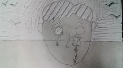
The first image shows the beginning of my sketch in the dimensions of the linoleum block. I used elements such as line in organic and geometric forms similarly to Roy Lichtenstein. I also created a horizon line that became the platform for my "event". I then added the realistic contrast in pencil as to replicate what it would look like in ink. However, unlike Lichtenstein, I created heavy and dark contrasts, I envisioned this to look like a separation between the subject and hope perhaps. The next step was make a carbon copy of the sketch onto the linoleum block. This was fairly simple since the sketch was on paper and in the dimensions of the block. After making the carbon copy as illustrated in the third photo I began the carving process with a large carving tool. One change I made from the sketch was changing the nose from dark black to white mainly because you would not be able to see it if it was black. Additionally after a few prints I realized I needed more texture to make a cleaner print. So I added more birds in the bottom half of the piece. After this I made multiple experimental prints to sort out the uneven parts of the print. This was the longest park of the process because it took multiple prints and after each one I had to was the block off so I could carve into it again. I used a brayer to apply liquid ink onto the linoleum block as shown in the 4th photo. The next step was placing a piece of paper onto the block and then pressing on it with a baren to make the ink stick onto the paper. The final print is the fifth image. |
|


Reflection
This project was a lot of work and for my first I am fairly satisfied with the overall result. I felt successful with all of my research and connections to my inspiration but I feel my block print itself fell short of what I had planned it to look like. I produced eleven prints and only a few came close to capturing the detail my planning sketch had. If I had spent more time experimenting I believe I would have been able to spit out a product that had the contrast I was looking for. One thing I am disappointed in is the non-fully shaded areas of the piece where the ink was not completely black. However one thing I really liked about my block print is the way the ink makes the image appear fuzzy almost like a vintage photo. That is something I had not anticipated but actually strengthens the piece. I am also very proud of the way I clay carving tools to fix the rose in a more detailed way. Overall I feel like this piece really fits into my chosen theme and art movement. Pop art while abstract and wacky is a great way to express and I felt I found this in Roy Lichtenstein's work. Additionally I completely changed his style to accommodate myself in a unique way that hasn't been seen before.
ACT Responses:
1. Clearly explain how you are able to identify the cause-effect relationships between your inspiration and its effect upon your artwork.
My inspiration was the director of my pieces design and theme. Lichtenstein's use of simple lines to create deep meanings guided my piece to become what it is now. His symbolism can be seen in my piece when connecting elements to theme.
2. What is the overall approach the author has regarding the topic of your inspiration?
The author approached my inspiration objectively, only breaking Lichtenstein's work down for it's principles and values but not it's meaning. It also addressed the works impact on the art movement.
3. What kind of generalizations and conclusions have you discovered about people, ideas, cultures etc. while you researched your inspiration?
Pop art shares many values with the expressionism art movement, artists are not confined to what is realistic or normal but what they see and feel.
4. What was the central idea or theme around your inspirational research?
My theme was to become involved in a subject matter I hadn't worked with before, as to see how creators express through different mediums.
5. What kind of inferences did you make while reading your research?
I made the inference that Roy Lichtenstein used comic book art with diverse messages as to target a different demographic of viewer.
Bibliography
- H. (1970, January 01). Roy Lichtenstein Inspired Kawaii Paintings. Retrieved September 11, 2017, from http://artintertwine.blogspot.com/2015/02/roy-lichtenstein-inspired-kawaii.html
- Exhibitions. (n.d.). Retrieved September 11, 2017, from http://americanart.si.edu/exhibitions/online/crosscurrents/lichtenstein-landscape.cfm
- Roy Lichtenstein Biography, Art, and Analysis of Works. (n.d.). Retrieved September 11, 2017, from http://www.theartstory.org/artist-lichtenstein-roy.htm
- Drowning Girl. (2017, August 31). Retrieved September 11, 2017, from https://en.wikipedia.org/wiki/Drowning_Girl
