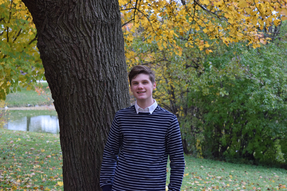
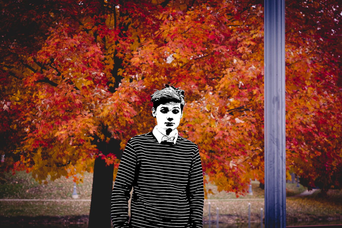
Abstract #4
Model 685
Photograph/Digital Edit
50.8 cm x 28.6 cm
November 2018
Photograph/Digital Edit
50.8 cm x 28.6 cm
November 2018
Exhibition Text
Modelling is very unique field of work in which you are typically only used or employed because of the way you look. "Model 685" assigns a numerical value to the model in the photo, the model is also stripped of his color implying that his values are not expressed in the photo. Photographer Jacquelyn Nytes selects models based on their background, and uses them so that she can share their stories. This piece is meant to expose the areas that modern modelling and photography is lacking in.
Modelling is very unique field of work in which you are typically only used or employed because of the way you look. "Model 685" assigns a numerical value to the model in the photo, the model is also stripped of his color implying that his values are not expressed in the photo. Photographer Jacquelyn Nytes selects models based on their background, and uses them so that she can share their stories. This piece is meant to expose the areas that modern modelling and photography is lacking in.
Planning
|
Inspiration
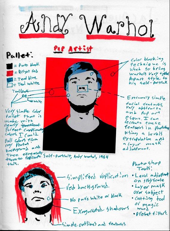
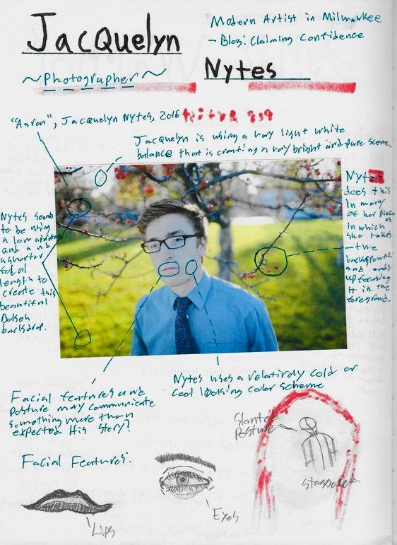
I started my fourth project by researching more Cinema 4D artists and abstract renders, many things caught my eye but none of the pieces I saw inspired me to create something that meant something to me. My comparative study artists Jacquelyn Nytes runs a blog called Claiming Confidence, this blog focuses heavily on the life stories and experiences that the models have to share. This made me wonder if the subjects got to chose their backgrounds as to reflect or express something about them based on their choice of scenery. In many of her portraits she has an element in the background blurring into focus, in "Chloe" she uses the bush to blur into the foreground and in "Aaron" she blurred the background tree into focus as well. This small detail is quite wonderful and I immediately started thinking of ways I could include a second foreground object in my piece. I knew this would be a bit challenging because prior to this project I have little to no experience with photography and using legitimate cameras and techniques. While the photography portion of this project would definitely be challenging I knew that I would also be doing a fair amount of post processing to the image(s). When thinking of portraits and self portraits two of my favorite artists are Andy Warhol and Mark Greenwalt. Both of these artists do abstract art however Warhol creates pop art primarily. Every color he chooses pops and is vibrant and yet his pieces always feel very balanced. When it came to the meaning of my piece I decided it would be appropriate to adopt a similar pallet to Warhol as to show the vibrancy of the background but the lack of color in the model. I briefly thought about painting over the photo however I later decided that I had greater technique and control over my digital work in Photoshop and decided to approach the piece with that in mind. Another inspiring part of Warhol's self-portrait was his choice of facial expression. He is very plain faced and sterile/serious looking, this was something I wanted to achieve in my own piece. In reflection I would have preferred to exaggerate the facial features a bit more when going in a touching up the picture in Photoshop. When going about my planning sketches I decided to start with fairly simple looking drawings that looked quite similar to this piece in particular. One of the more interesting parts of this project was definitely finding the best way to combine the simple style of Warhol and the very sensitive and expressive side of Nytes. |
"Chloe", 2016, Jacquelyn Nytes | "Aaron", 2016, Jacquelyn Nytes
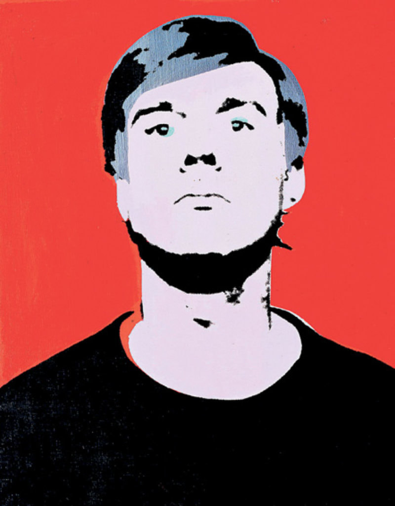
Early Self Portrait, 1964, Andy Warhol
|
Planning Sketches
|
|
These first two pages I did were inspirational pages that helped me explore the artists I was focusing on. These significantly aided me when it comes to figuring out how I would combine the two art styles together, I took a piece by both artists and broke it down as to analyze it's elements and principles of design. I tried breaking down each artists color pallets, techniques, framing, and subject portrayals. Towards the bottom of each page I tried sketching out and recreating aspects of the artists styles and pieces. This helped me visualize how I would pose my model, and what facial expression he would bear.
|
|
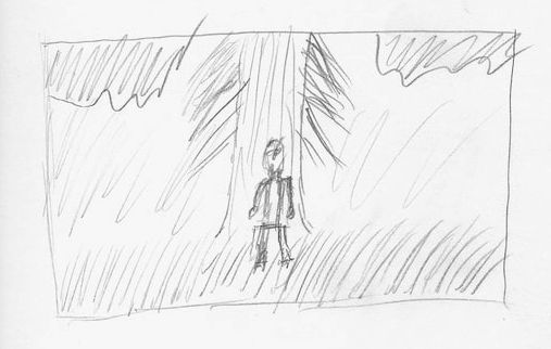
This crude planning sketch strictly dealt with framing and photo composition. I knew from this sketch that I wanted my portrait shot to be outside, I also knew I wanted a tree or some large object in the background that would be cropped out of frame at the top. When it comes to weather and lighting I wasn't too sure as to what I wanted, however I knew that even if the lighting was bad on the day of the photo shoot that I would be able to fix it in post processing. I didn't quite know how I would have the background blur into the foreground at this point in my planning so I left that area of planning up to improvisation. |
|
|
I decided that I needed to just get out and start planning out my final shot by practicing different compositions and framing styles. This part of my planning process helped the most by far, I was able to scout out different areas of interest and play around with different postures, facial expressions, and moods with my model. This picture was nicely framed but it lacked the color scheme shown in Andy Warhol's self-portrait and that pallet was something I really wanted to incorporate into my piece. This planning photo process also helped me strengthen my technique because before this I had never used a semi-professional camera for an extended period of time. |
Process
|
My project had 4 phases to it: Planning and practicing, photographing, post processing the RAW files, and adding final edits in Photoshop.
Photographing: Seeing as I already covered my planning and practicing phase above in the planning section, I will move right into my camera technique. After playing around with the different camera modes I landed on Aperture Priority mode, this mode allowed me to manually control how wide the lens would open to let light in. I used a Nikon D3300 and an 18 - 55 mm kit lens as my camera rig. I stuck with a lower aperture around 1.2 as to achieve a blurred background while still keep a sharp focus on the model. I bracketed my shots in sets of three and ended up taking 574 photos in total. I discovered the importance of focus breathing and perspective of the camera while working on this project. Post Processing: I did all of my file compression and RAW editing in Adobe Lightroom Classic CC 2018. Before this project I had never used Lightroom, but I now know how to do some pretty basic editing that can really sharpen and finalize an image. The first step was going through all 574 photos individually, this took a ridicously long amount of time seeing as I had to check if each photo had an blurring, chromatic aberration, or poor framing. Once I sorted through all of the images and deleted that unwanted ones I was left with 96 pictures, from here I began building my Lightroom Preset. I edited the exposure settings, changed the white balance, cranked the red balance, and added heavy vignetting. Following this I was able to select the photo that best fit this preset and seemed to be the best composed. This was photo 685, which is where part of my title comes from. |
|
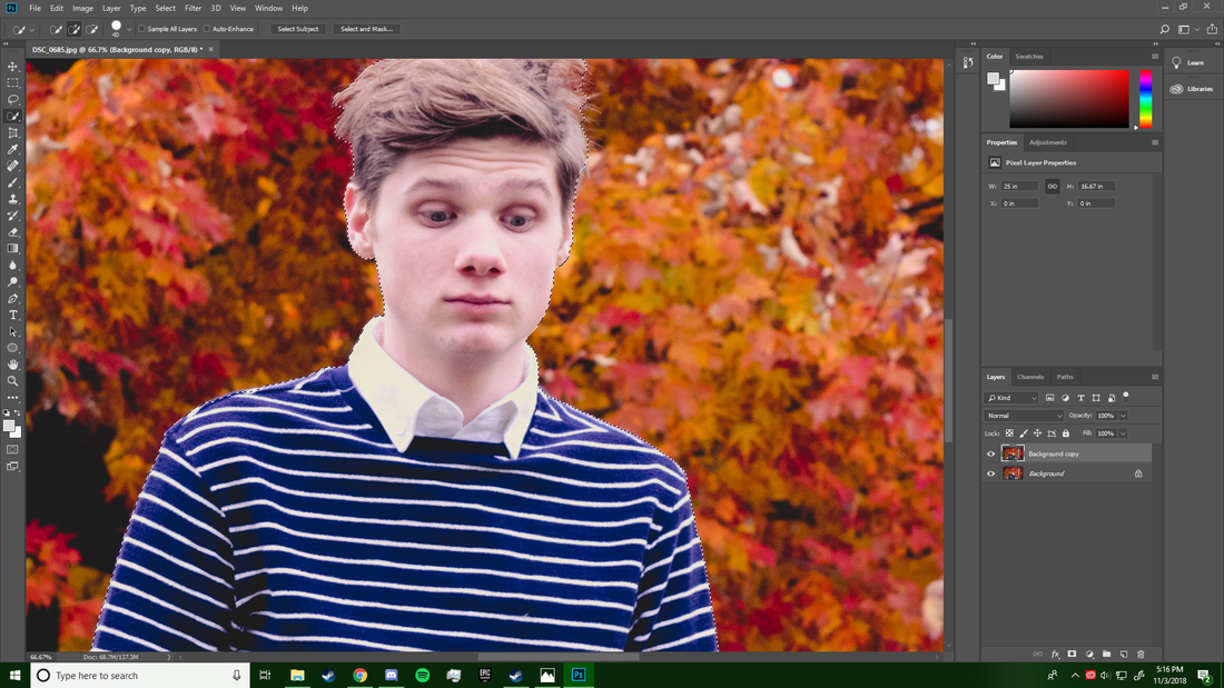
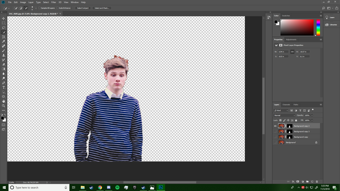
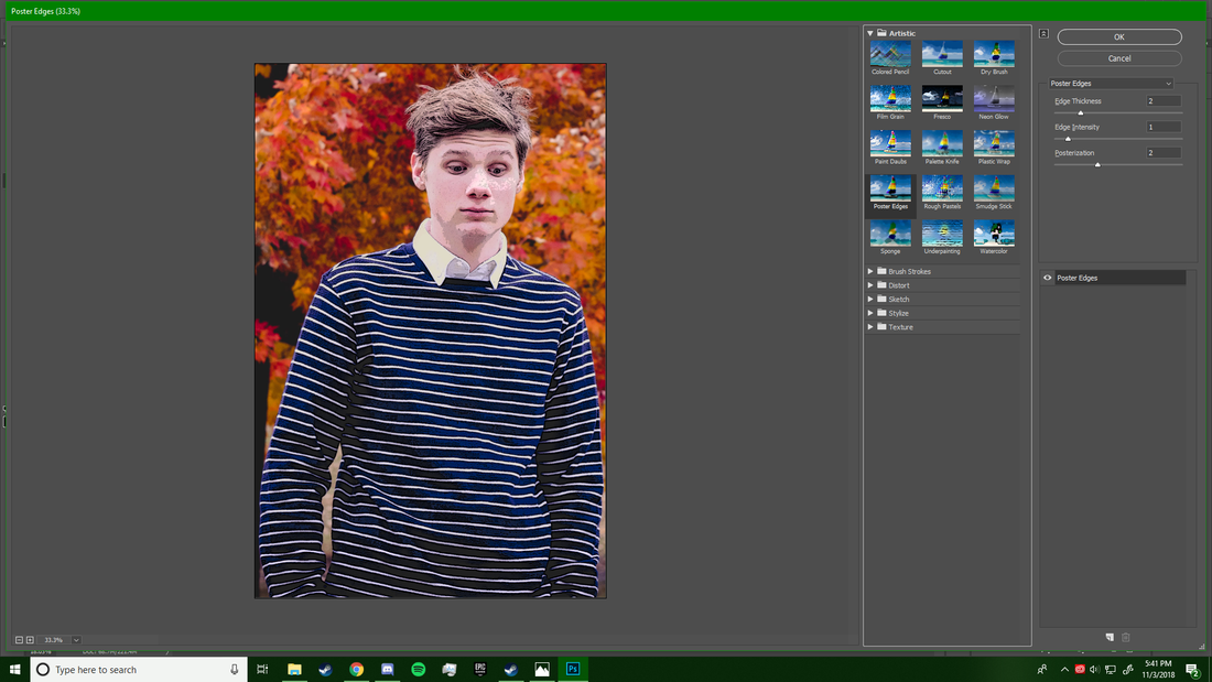
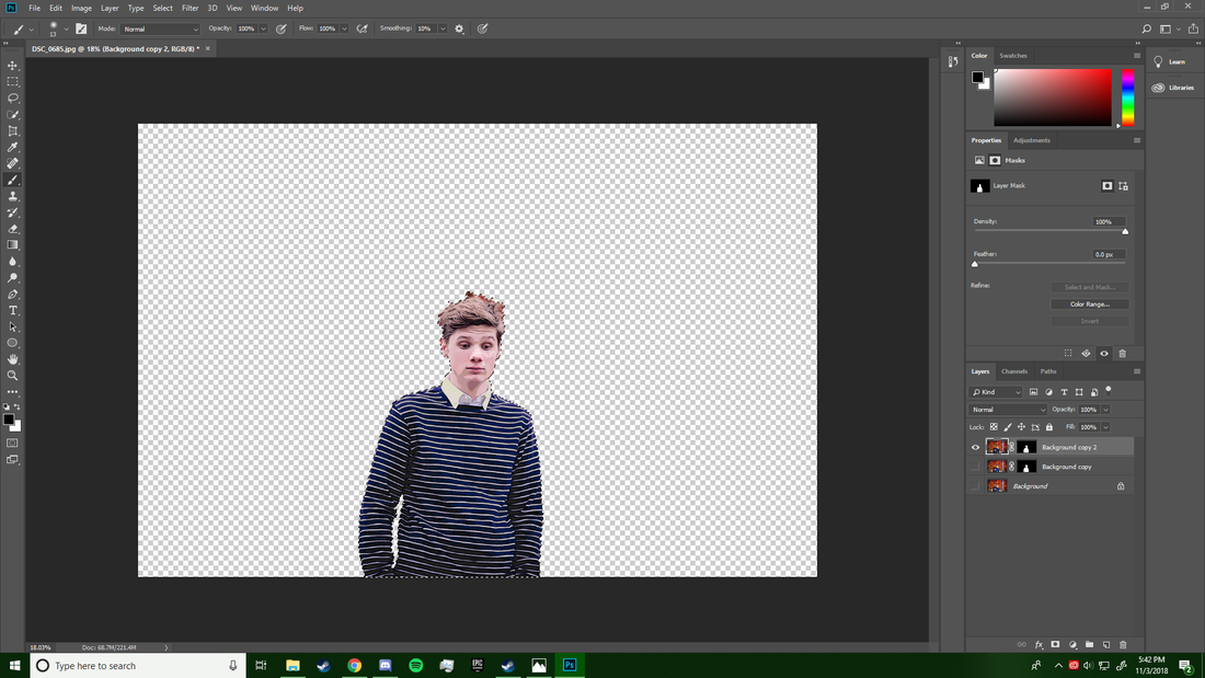
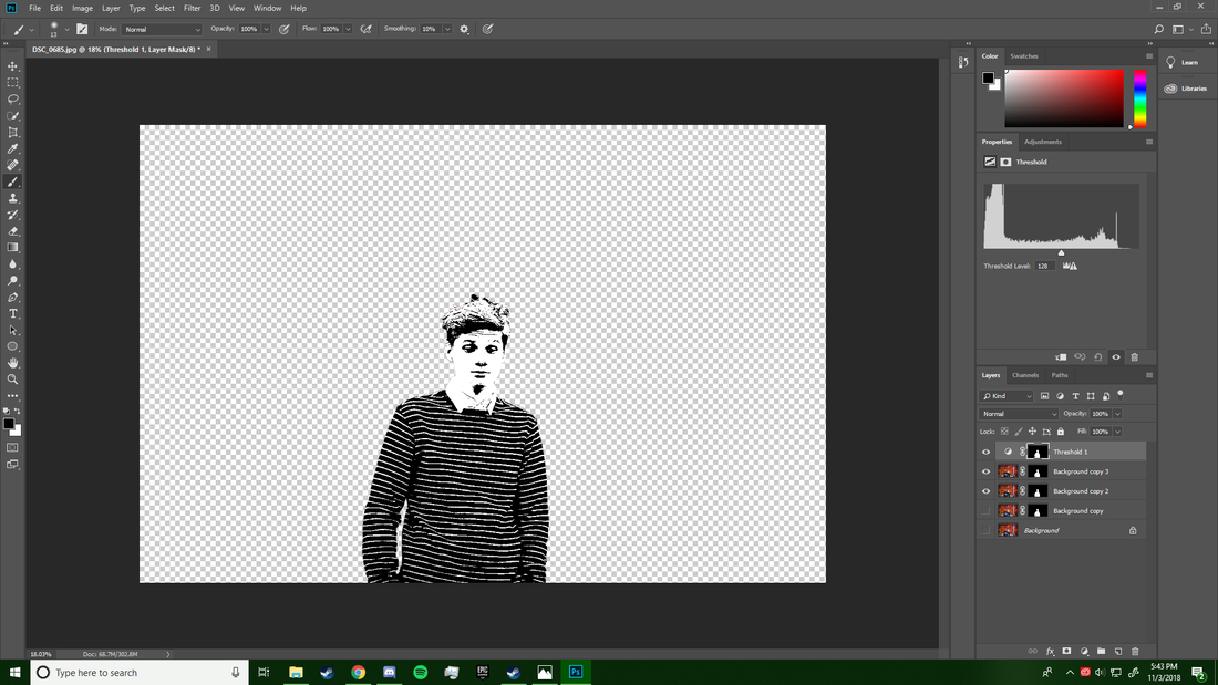
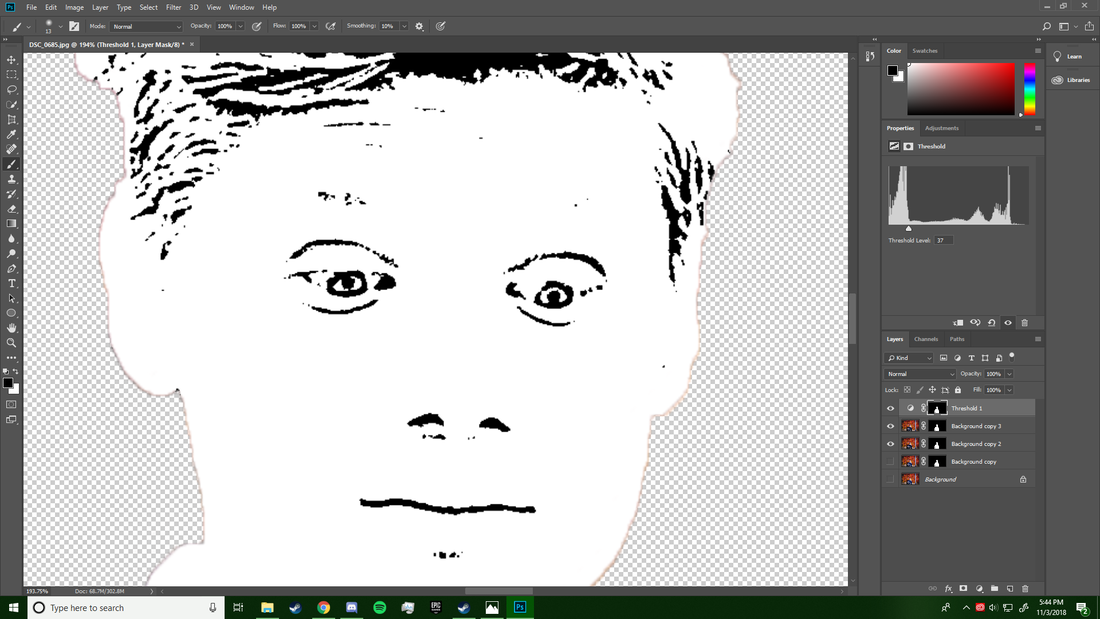
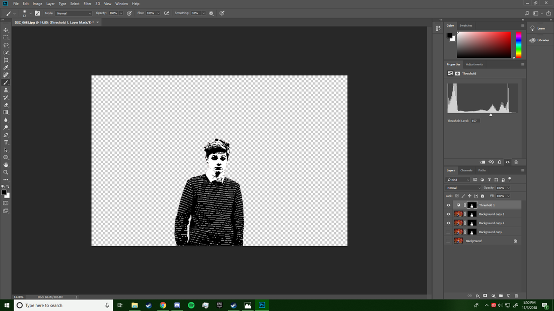
Photoshop: The Photoshopping phase was surprisingly the longest phase of this project even though I have the most expierence in Photoshop and already knew what I wanted to do with the piece. To begin I used the Quick Selected tool to carefully cut out my model and create a layer mask out of him. Once he was cut out and moved to a separate layer I applied a simple Poster Edge filter to him which created a heavier and less blended colors across him. I did this so that my level adjustment would be far cleaner. My level adjustment took those colors and made them either black or white, no shades or grays. This next part was the most painstaking and yet rewarding part of the process. I used the pencil tool to pixel by pixel fill in different facial features, this included the hair, eyes, chin, eyebrows, nostrils, ears, lips, and jaw bone (also the shirt collar, which isn't a facial feature). This took about three days to complete and seriously was very tedious. The final step in Photoshop was tweaking the file so that I could upload it to Weebly. To do this I made it a JPEG, reduced the scale by 20%, and lowered the quality to 95%.
Experimentation
This project was focused on blending the styles of Jacquelyn Nytes and Andy Warhol. I experimented with contrasting the subject from the foreground as to break the unity and also using a more industrial balance as to shift from Nytes organic style to my own. When it came to showing the expression of the subject I only used 2 values: black and white, however I experimented with various other color combinations such as mustard yellow and black or teal and black. I landed on black and white because it felt the least expressive but simultaneously the most moody color combination. Another portion of my experimentation had to do with the orientation of the camera. I attempted shooting in both portrait and landscape orientations. After various shots it became pretty clear that portrait was far too narrow to include the lush fall background. I also experimented with the camera position and perspective, I tried squatting and shooting up, or shooting down on my subject. In the end I shot slightly below the eye level of my model. The background was extremely important to this project and finding the right background was by no means easy. I experimented with water, brick, forest, and mixed backgrounds. In the I mixed together these backgrounds and had a primarily organic composition combined with a very urban light pole.
Reflection
This project was quite an enlightening first exposure to photography. That day me and my model took 574 photos each, we walked around the Hank Aaron State Trail and took roughly 50 photos at each spot. It was ridiculously complicated and difficult to figure out how to properly use the camera settings and blur the background while still having multiple foreground subjects in focus. In the end my better photos came out towards the end of the shoot and this was a very rewarding feeling. I'm very satisfied with the outcome of the piece and I think relates perfectly to my comparative study pieces by Jacquelyn Nytes. It was quite enjoyable doing the post processing and bringing out the Red-Orange color balance from the fall leaves in the background of the shot. Going forward I plan on doing much more photography and trying to find unique ways to blend mediums.
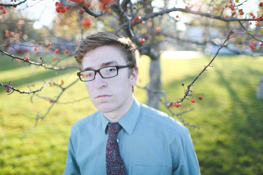
"Aaron", 2016, Jacquelyn Nytes
Differences:
|
Compare & Contrast:
Similarities:
|
"Model 685", 2018, Henry Locke
Differences:
|
ACT Responses
Clearly explain how you are able to identify the cause effect relationship between your inspiration and its effect on your artwork.
My inspiration directly caused me to select photography as my medium for this artwork and it influenced my choices in models, backgrounds, color schemes, and photographic techniques. My inspiration is quite easily identifiable by looking at my own artwork because of the close resemblance in color balances, framing, and expressions of the model.
What is the overall approach the author has regarding the topic of your inspiration?
The author primarily focuses on the artists meaning and choice of subject. The author runs a blog that contains information and stories relating to all of the artists models.
What kind of generalizations and conclusions have you discovered about people, ideas, culture, etc. while you researched your inspiration?
My inspiration focuses very much so on the generalizations that people will make just by looking at a model or subject. Many people would come to conclusions about someones background just by looking at a photo when in reality everyone has their own stories and experiences that make them unique and different.
What is the central idea or theme around your inspirational research?
The central idea around my research has always been abstract art and this project was no exception. The photographer Jacquelyn Nytes and pop artist Andy Warhol are both very abstract artists and use their mediums in ways that are exclusive to themselves.
What kind of inferences did you make while reading your research?
I made inferences primarily on connections that Nytes and Warhol might share based on their artwork. They both want to produce a captivating image that has hidden meaning, for Nytes this meaning was a story and for Warhol this could be a large variety of things many times relating to social commentary.
Bibliography
- “Andy Warhol: Self Portraits.” MAP Magazine, 14 Feb. 2005, mapmagazine.co.uk/andy-warhol-self-portraits-edinburgh
- Nytes, Jacquelyn. “Blog: Claiming Confidence.” Jacquelyn Nytes, 2016, www.jacquelynnytes.com/claiming-confidence/
