Illustration Positive
|
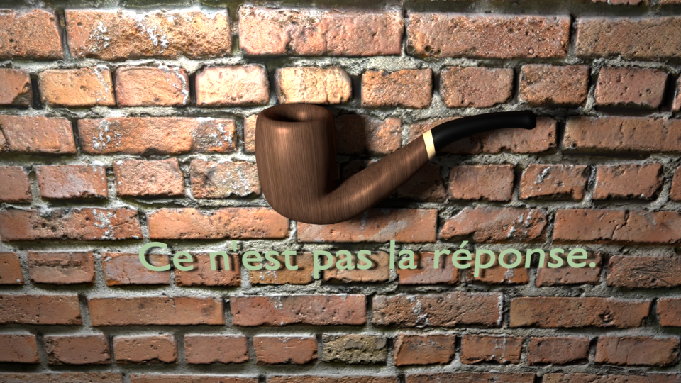
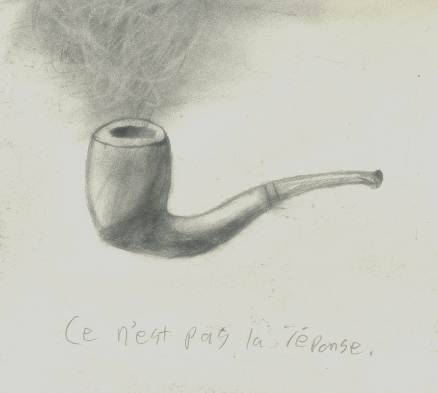
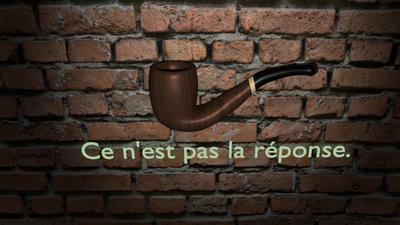
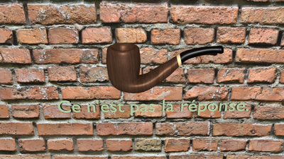
Smoking Kills
Blender 30 cm x 40 cm November 2017 Exhibition Text"Ce n'est pas la reponse." Is french for, "This is not the answer." In modern society smoking viewed as a highly negative and harmful activity rightfully so. The purpose of this piece is to play around with Rene's "The Treachery of Images" and make it an anti smoking advertisement you might see today. Smoking is not the answer to any problem and I hope this is communicated effectively in this work.
|
|
Illustration Negative

|
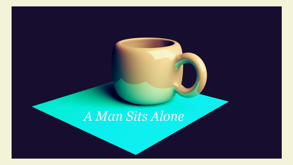
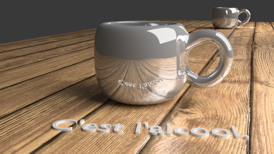
Your Cup of Tea
Blender 30 cm x 40 cm November 2017 Exhibition TextThings are made to look pretty in modern society, especially when a company is trying to sell it to you. The goal of "Your Cup of Tea" is to communicate the problems with alcohol being advertised and seen as a miracle beverage. Alcoholism can be as destructive as smoking and viewing it as a shiny cup tea shows just how normalized it has become.
|
Inspiration
|
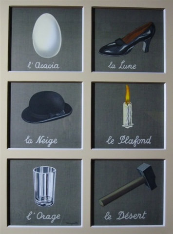
Rene Magritte has been a king of surrealism long past his time alive. His takes on imagery and every day objects inspired to create my artwork. Specifically his piece "Ceci n'est pas une pipe" inspired me to look closer at modern society. Much of the world has deemed smoking as a highly unhealthy activity, rightfully so, and I thought it would be interesting to take a similar approach to Rene and still use french. Additionally I was inspired by a burning cigarette on #FinishIt's website, it puts true meaning behind the impact of smoking, you are literally smoking your health and time on earth away. Once again this piece uses a simple object like a pipe or cigarette and then uses text to imply a deeper meaning. Deeper meanings shouldn't have to sought after, it is important to sometimes be blunt in art. For my second work of art "Your Cup of Tea" I wanted to stick with the same artist but show societies acceptance and promotion of other harmful substances. Alcohol is the largest harmful substance being advertised everywhere you go. Additionally it is made to look angelic or other worldly when in fact it will bring you down to earth pretty quickly the day after you become intoxicated. The advertisement for Absolut vodka really got my message across the way I had envisioned it, so I used them as inspirational material. My inspiration has a lot to do with negatives, but it is a very positive thing that smoking is so heavily criticized by society, it is healthy for this mentality to be encouraged in the future. One of the other key things I gained from my inspiration was the idea of simple but purposeful objects. Rene used objects like a hat, shoe, candle and hammer each of these is compromised of simple materials, additionally it is fairly simple to use each of these objects for their implied uses. I was inspired to replicate this sense of simple objects with simple uses in my own work.
|
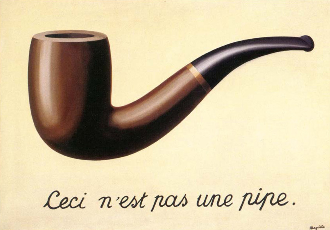
"Ceci n'est pas une pipe", René Magritte (Belgium, 1898-1967)
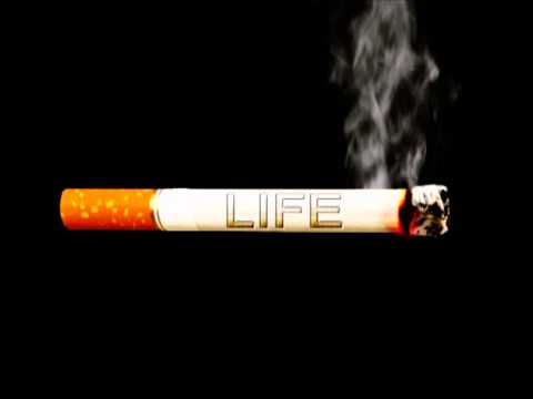
"Life", Unknown, 2014
|
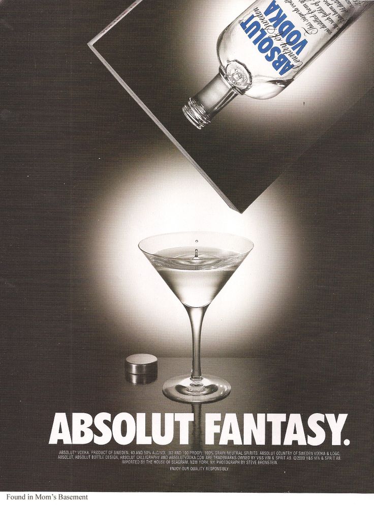
"Absolut Fantasy", Unknown, 2000 "The Interpretation of Dreams", Rene Magritte, 1927
Planning and Sketching
|
My first sketch in the middle of the pipe, was my initial idea for the piece. I wanted to keep the realism of Rene's work but also do something new and different with the meaning and portrayal of the pipe. This later inspired me to add the brick wall backdrop, you might see a brick wall in a modern setting and that is why I adopted it as a modern background. This sketch is also where I introduced the french aspect to the work "Ce n'est pas la reponse" translates to "This is not the answer", once again this is meant to be a critique on society and also communicate that smoking is a highly dangerous activity and should not be engaged in. Another thematic idea I developed while planning was the treachery of portrayal. Much of advertising has to do with the portrayal of the object, so I decided it was important to use this in my work.
|
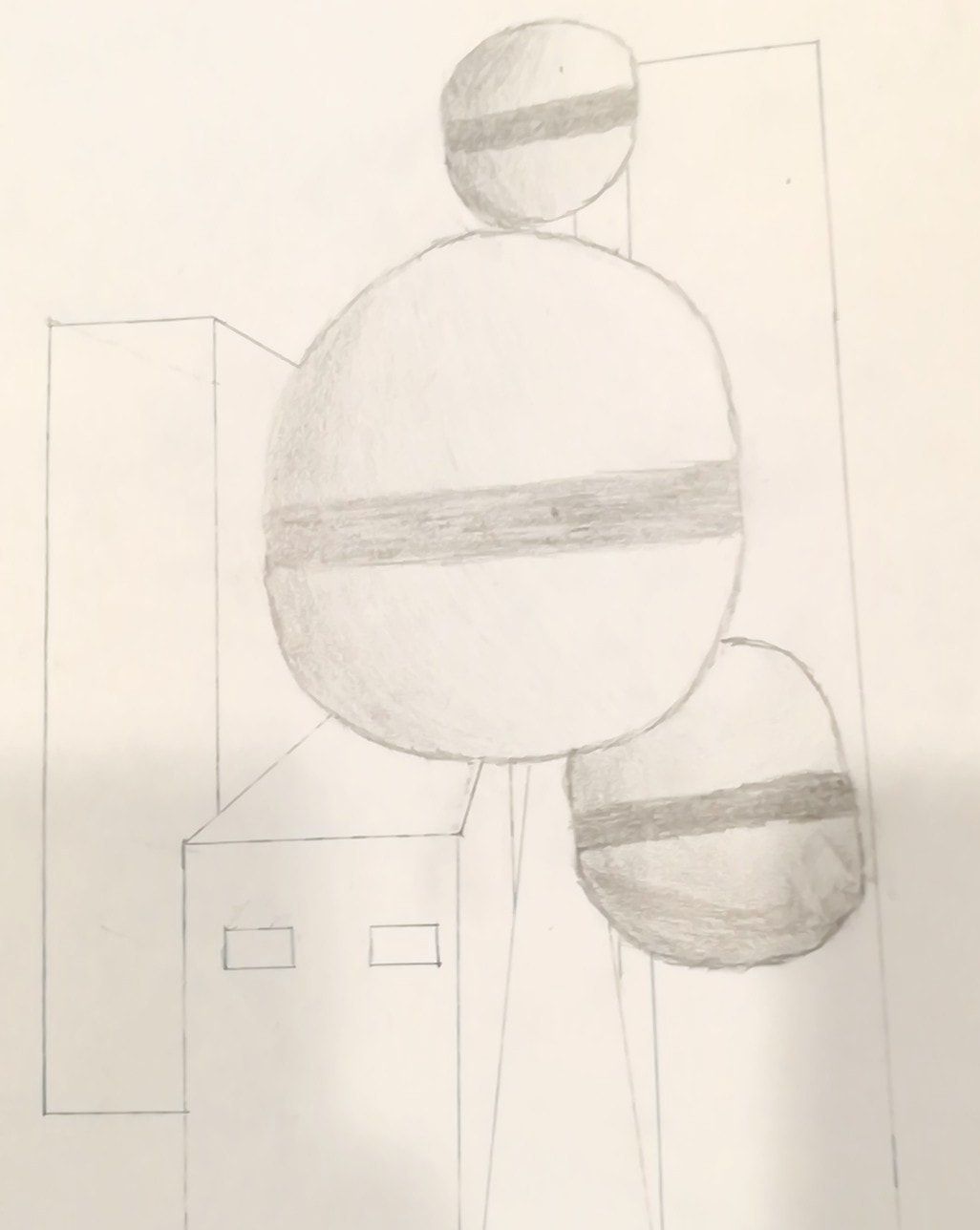
This next sketch was derived from another one of Rene's artworks "The Listening Room". I wanted to perhaps show the control of advertising over a city or population. However I realized I could not logically connect this to a positive or negative implementation of Rene's work and thus quickly moved on from the idea. If I were to have proceeded with this sketch I would've made the balls to appear alien and I would have made the city downtown Milwaukee with the Art Museum in the background. |
This planning design I did in blender, I wanted to go a bit hands on with the software before learning and starting my project. I wanted to go with another simple object, so I chose a tea cup. The tea cup is simple but has complex curves, and similar properties to the pipe I later designed. I also did some additional post image editing, adding different grain effects and text objects onto the screen. This planning design was an idea of what the finished scene would look like with text, shading, multiple objects, and reflections. This heavily influenced my end result, it is also very similar to Rene's style of light contouring on curved objects.
|
Process
|
|
Positive:
Learning and rendering in the 3D design program; Blender has been one of the most complex processes I have done in art. The first part to the process was sketching out the pipe with the new text. The next step was uploading the image of the pipe to Blender in ortho view mode. Ortho view mode lets you proportionally line up assets and images within the program. Following this step I added a basic cylinder mesh to the canvas. After adding the cylinder you must subdivide the number of vertices and edges it has to be able to further manipulate the form of the pipe. I extended the circumference of the cylinder to match that of the circumference of the pipe. The next step was adding an outline mesh for the pipe handle, this adds a line segment that can manipulated in 4 separate parts. |
After creating this line mesh I created a 2D circle mesh and assigned it's circumference value to equal that of the lines circumference value. By increased the circumference of the circle I also increase the circumference of line. However this method did not work and result in an ugly thick line that did not resemble a pipe handle. My next idea was to smooth the faces of the pipe so that there would be more faces made. By making more faces on an object you allow yourself more areas to extrude the object. I selected the bottom vertices of pipe and extruded, rotated and pulled them. This required nearly 70 separate extrusions and manipulations to complete. Once the pipe very closely resembled the shape of the original pipe I began to indent the surface of the top of cylinder. This made a cavity in which you would stuff the pipe with tobacco, I did the same thing to end of pipe handle for the inhale hole. Following this I added a velvet carpet beneath the pipe and added a starting material to the pipe to made it appear a bit more realistic. After smoothing and extruding surfaces until the pipe form looked correct I did my first render. Following this I began researching the texturing I would in order to create a realistic brick wall. To create the brick wall I would 5 high resolution texture maps; a gloss map, reflection map, UV map, color variation map and finally a negative map.
|
After downloading these maps from Poliigon I began working on the details of pipe. I grabbed the same 5 maps to create the wood texture on the pipe, but instead of a brick image I used dark mahogany wood texturing. To apply gloss, reflection, color and mapping values you must open the node editor and map out these values and connections by hand. After multiple attempts and many node maps I finally created the wood texture with the correct coloration and texture lighting. Next was subdividing the pipe into 3 sections to create the 3 different materials seen in Rene's piece. Following this process I created the following two textures of light wood and a plastic black. The next step in the process was creating a brick wall, I started by adding a simple plane mesh and scaling it up to about 5x the size of the camera frame. I used the same process to texture the brick wall as I did the pipe, using more complex node maps and texture mapping.
|
|
The next step was creating atmospheric lighting similar to "The Treachery of Images" and Absolut vodka's ad. This required an bidirectional light lamp with a spotlight frame. I adjusted the opacity to become a gradient of light to dark. The next step was adding light emitting text to the bottom of piece. This required a glowing material the emits green light. The final step was framing and rendering the image. After creating a camera panel I adjusted the resolution size, pixel density and GPU rendering intensity.
Negative:
The negative illustration project uses the same program as the positive but has different objects and surroundings which required me to start from scratch. To start I also began by creating a cylinder, however this particular cylinder was not subdivided as many times and did not have subsurface or thickness modifiers applied to it. Also I started by intruding and indenting the cup to create the hollow portion of the mug. After this was created I began work on the mug handle. With the mug handle I created a geometric line and sculpted it into the proper handle shape. Following the molding of the handle I needed to thicken it so I connected the properties of a 2D cylinder to line handle and then increased the circumference of the circle and added a subsurface modifier so that the mug handle had multiple faces and vertices. To connect the handle to the mug itself I deleted 2 faces and then extruded 4 faces to each handle connection and welded them into place. This created a smooth appearing handle connection with not unnecessary extrusion. Following this I subdivided the surface a bit as create a smoother rendering, this adds more faces to the object which makes it appear more smooth but requires beefier hard ware to operate and manipulate. Following this I began adding thickness modifiers to made the objects have more ceramic looking surfaces and textures.
The negative illustration project uses the same program as the positive but has different objects and surroundings which required me to start from scratch. To start I also began by creating a cylinder, however this particular cylinder was not subdivided as many times and did not have subsurface or thickness modifiers applied to it. Also I started by intruding and indenting the cup to create the hollow portion of the mug. After this was created I began work on the mug handle. With the mug handle I created a geometric line and sculpted it into the proper handle shape. Following the molding of the handle I needed to thicken it so I connected the properties of a 2D cylinder to line handle and then increased the circumference of the circle and added a subsurface modifier so that the mug handle had multiple faces and vertices. To connect the handle to the mug itself I deleted 2 faces and then extruded 4 faces to each handle connection and welded them into place. This created a smooth appearing handle connection with not unnecessary extrusion. Following this I subdivided the surface a bit as create a smoother rendering, this adds more faces to the object which makes it appear more smooth but requires beefier hard ware to operate and manipulate. Following this I began adding thickness modifiers to made the objects have more ceramic looking surfaces and textures.
The next step in the process was the material building, once again this was done in the Node Mapping editor. When it comes to creating a ceramic texture it is unnecessary to use texture maps like I did with the pipe and brick wall in the previous project. Instead I went about creating the ceramic texture by hand. To do this I created a Diffuse BSDF and a Glossy BSDF material and then mixed them with a mix shader. This initially appeared metallic, to fix this problem I added a color shader into the mix that was a creamy tan. The overall extreme gleam of the mug however was purposeful, I needed an extreme reflection to show the camera angle and the surfaces reflecting off the mug. The next step was creating the beautiful and glossy wood floor beneath the mug, this was done with texture mapping and node mapping. I subdivided the simple mesh plane into 4 chunks and then UV unwrapped each one and applied the 5 texture maps to each one. This texture was much more complicated than the brick wall texture because of the higher resolution image I was working with, you can see I also manually added gradient light editors which controlled the amount of light a certain part of the surface would actually be reflected. Next was the addition of the light panel, I used a simple mesh plane and attached the properties of a lamp to it and used this as my "modern lighting". The next step following this was creating a mirror that reflected the back of the cup which essentially made a double image. Finally was the addition of 3D text poking out of the wood boards.
Experimentation
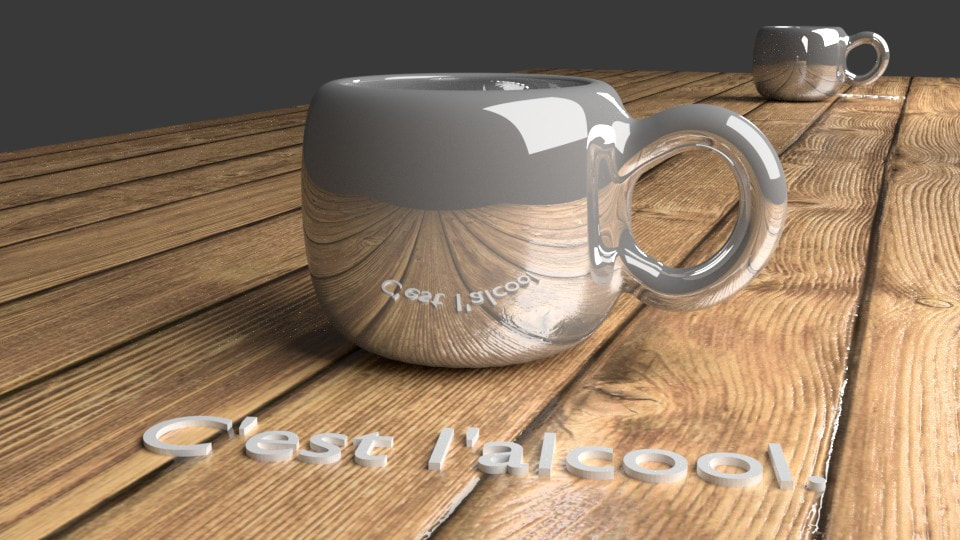
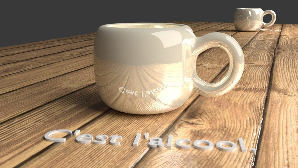
When it comes to experimenting with the outcomes of each of the illustrations I was focused on elements such as realism, lighting, positioning and composition. One the things I truly went in depth in experimenting and playing with was the atmospheric and world lighting. Particularly with the pipe I edited the lighting multiple times looking for the right aura to be set around the pipe, more specifically I was looking to draw parallels between Rene's work and Absolut's ad. The majority of my problems came from making the light sources to large or two small. The first attempt I made on the bottom left is a spotlight that lost its brightness the further away from the center you got. I eliminated this concept because it put to much focus on the writing beneath the pipe. Next I experimented with bright panel lighting. I created a panel light similar to that of mug's panel light and placed it at a 45 degree angle looking down on the pipe. This however created a scene in which there were no shadows, and the light was consistently intense. I needed variation that put proper focus across the piece not just on a specific area or lack of an area. My final choice for lighting was a bidirectional lamp light that provided similar lighting to "The Treachery of Images", with light shining down on the piper from the upper left corner of the image and casting long shadows. The next element I experimented with was Camera angle, for the pipe I knew I wanted to replicate the angle of "The Treachery of Images" but with the cup I experimented with a few different angles that revealed different qualities. The first angle I chose did not allow you to see the second cup in the back of piece. I wanted this cup to be shown because of it's critical message of a second glass lining up after you have already had one. I did not want a third cup to be present because that would take the subtlety of message away. The final thing I experimented with that was critical to the piece or worth mentioning was the color of the mug. The mug was initially going to be grey like the glass in the Absolut vodka ad, however I wanted it to be in disguise just like alcohol is advertised currently.

Reflection
I am extremely satisfied with the hard work I put into this project and glad to have gained critical knowledge about 3D rendering and artistic connections. The program I used to do this project is called Blender, there is a feature on Blender that stores the number of hours you use the software for... Going into this project I had not prior experience with Blender so I had to watch hours and hours of videos to the different processes and tools in the program and even after I had done this I still needed to be able apply these processes to my own unique ideas. By the time I finished the illustration projects I had 77 hours in Blender! That's a little over 3 days of straight rendering and modeling... Not including the time spent sketching, drafting, reflecting, researching and planning. Because of this severe learning curve that I tackled I am all the more satisfied with my work. When it comes to my piece "Smoking Kills" I am really satisfied by the way the lighting covers the pipe just like it would have in "The Treachery of Images". However I am not satisfied with my ability to create unique looking text and fonts. My current text has a deep message but is somewhat ugly and green. While the text does glow I would change it's color and font type.
My second piece "Your Cup of Tea" was a slightly more polished work. This is because I had already run through the different processes on "Smoking Kills" about 10 times. I felt well prepared and ready to creatively design a scene that looks like something out of a magazine or fancy webpage. Perhaps my proudest achievement in this project was the texturing of the wooden planks. The wood has realistic and polished grain to it that can be seen in the way shines and reflects light. Creating the Node maps was probably the most complex part of the entire process but completely necessary if I wanted my work to resemble anything close to Absolut or Rene. However I feel a similar frustration regarding the font of text in this piece as well, it is modern which is good but it doesn't have character, it's only attributes are it's angles of presentation and it's thickness. One final critique regards the color of the final mug, it looks tan not ceramic and this could have been fixed with more time. I wish it would have been a shell white instead of a creamy tan.
My second piece "Your Cup of Tea" was a slightly more polished work. This is because I had already run through the different processes on "Smoking Kills" about 10 times. I felt well prepared and ready to creatively design a scene that looks like something out of a magazine or fancy webpage. Perhaps my proudest achievement in this project was the texturing of the wooden planks. The wood has realistic and polished grain to it that can be seen in the way shines and reflects light. Creating the Node maps was probably the most complex part of the entire process but completely necessary if I wanted my work to resemble anything close to Absolut or Rene. However I feel a similar frustration regarding the font of text in this piece as well, it is modern which is good but it doesn't have character, it's only attributes are it's angles of presentation and it's thickness. One final critique regards the color of the final mug, it looks tan not ceramic and this could have been fixed with more time. I wish it would have been a shell white instead of a creamy tan.
ACT Responses
1. Clearly explain how you are able to identify the cause-effect relationships between your inspiration and its effect upon your artwork.
Rene Magritte effected the realistic qualities of my artwork in Blender. I wanted to draw a heavy relationship between his figures, angles, and possibly messages in my own artwork. This is why I implemented images from his artwork.
2. What is the overall approach the author has regarding the topic of your inspiration?
The authors approach was strictly historical and factual, it was based on his life and of course the art he produced. Their were some positive connections drawn between him and his development as an artist.
3. What kind of generalizations and conclusions have you discovered about people, ideas, cultures etc. while you researched your inspiration?
I concluded that much of art is not as carefully analyzed as it could be. It seems that people like to leave the leg work to the artist when it comes to meaning and theme, reviews and analysis's were not helpful in understanding Rene's work.
4. What was the central idea or theme around your inspirational research?
The central idea around my theme was the treachery of portrayal. Rene dead much work in his lifetime that focused on the treachery of images, I wanted to find works of art that showed danger in common objects.
5. What kind of inferences did you make while reading your research?
I made inferences about Rene's artistic meaning behind his piece "The Treachery of Images". I inferred that he was saying "Things aren't always the way they appear." I also made inferences about society, I inferred that society thinks smoking is bad and liquor is good.
Bibliography
- The Treachery of Images (This is Not a Pipe) (La trahison des images [Ceci n'est pas une pipe]). (n.d.). Retrieved December 01, 2017, from https://collections.lacma.org/node/239578
- #FinishIT. (n.d.). Retrieved December 01, 2017, from https://www.thetruth.com/
- Absolut Vodka (Publicidad). (n.d.). Retrieved December 01, 2017, from https://www.pinterest.co.uk/andreapallares/absolut-vodka-publicidad/
